The Limitations of iOS 8 Size Classes
I’m working on a sooper-sekrit project right now, which I’m hoping to launch before the end of this year, and which will support iOS 8 only. I’ve been enthusiastically picking up as many of the new technologies as I can, and one of the most exciting, to me, is the introduction of size classes.
This technology brings a change of thinking for developers: we discard the idea of fixed-size layouts, and use the power of AutoLayout to ensure our apps fit a variety of screen sizes.
I think this change is going to blow the doors open on all kinds of new form factors from Apple, including larger phones, larger tablets and even little watches.
But as I worked on my sooper-sekrit project today, I realized something about size classes that made me a little sad. While the technology makes it easy to adjust your layout for multiple device sizes, the path of least resistance is that your design will be largely the same, no matter what size device you’re using.
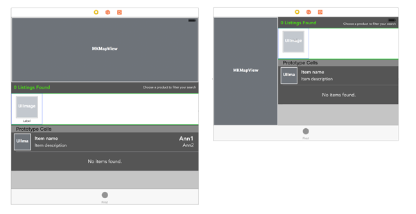
Here’s an example from my project. On the left is the standard layout for a screen I’ve created. On the right, the version of the layout with a “compact” height — in practical terms this would be on an iPhone in landscape orientation.

This is the same file with essentially a switch flipped, allowing me to move between size classes. The first size is the “base” upon which others are customized. In this case, I’ve decided to juggle things around quite a bit to best-suit that shorter height.
I think this is a terrific technology, but it made me realize that it only works well in certain circumstances. Specifically, if I wanted to use a completely different set of views between iPhone and iPad, I’m not sure how I would do that. Think of an example where, on the larger iPad, I don’t want to have a detail view in a separate screen; instead I want to integrate it into the overview screen.
This could simply be the result of my not knowing enough about size classes (I should probably go back and watch the relevant WWDC 2014 video!) — and I’m happy to hear otherwise.
But I suspect it speaks to an attitude on Apple’s part that has played since 2010, when the iPad was introduced. Yes, an iPad is “just a big iPod touch”, in that the UI has been scaled up for the larger screen. If you think about the iPad, and the best apps for it, you realize they provide more than just extra real estate for the same UI to move around in. They don’t have the same screens at all — they’ve been completely re-conceptualized for the iPad.
I’ve always been a big believer in the iPad as a replacement for the PC. Not everyone shares my vision, especially since Apple hasn’t done enough to distinguish the iPad’s software from the iPhone. Every summer at WWDC I hope that Apple will change the game by providing more-powerful features that take the iPad to the next level, providing a way to work with multiple apps at once, more-readily enter text, interact with files on a global basis, and more. Some of this stuff is happening, so I haven’t given up hope yet.
With size classes, though, Apple is clearly giving developers an almost too-easy way to add the iPad to their iPhone-only apps, upping the number of Universal apps. I just fear it will come at the cost of truly great, unique iPad apps.